_ Virginia Tech 21FA automavision I : the depth of frustums
tag: [teaching] [automavision] [virginiatech]
date: 20211209
class: 2021 fall VT architecture seminar automavision I : the depth of frustums
instructor: Nero Chenxuan He
review guests: Peter Testa, Devyn Weiser, Eames Demetrios, Natasha Sandmeier, Kristy Balliet, Joseph Bedford, Margarita McGarth, Chris Pritchett, Laure Michelon, Andrew Chittenden
students: Cyrus Du, Justin Liu, Mika Sun, Haodong Zhang, Jasper Zhang, Ruiqi Li, Ziming Fang, Yifan Zhang, Mary Aufuldish, Ziming Yan, Yibo Yuan, Tae Song, Minghao Sun, Tianlong Liu, Zixi Li, Yuxiang Cao, Hao Yan, Qiri Hu, Haotian Xu
This seminar is set up with an understanding that we are not at the beginning or the end but in the middle of the torrent of architecture. Architectural documents from different eras and cultures could be obtained with a click of a button regardless they are constructed or unconstructed, persevered, or destroyed. Instead of designing architecture, each student will be asked to resee one existing architectural product with a designed automavision workflow to create an archive of spatial segments, then take a curatorial role to upcycle a superposition, in architectural terms, by layering up visual information with techniques in cinematography. Students are asked to produce a short animation to uncover a new depth of a reconfigured familiar yet strange architectural product.


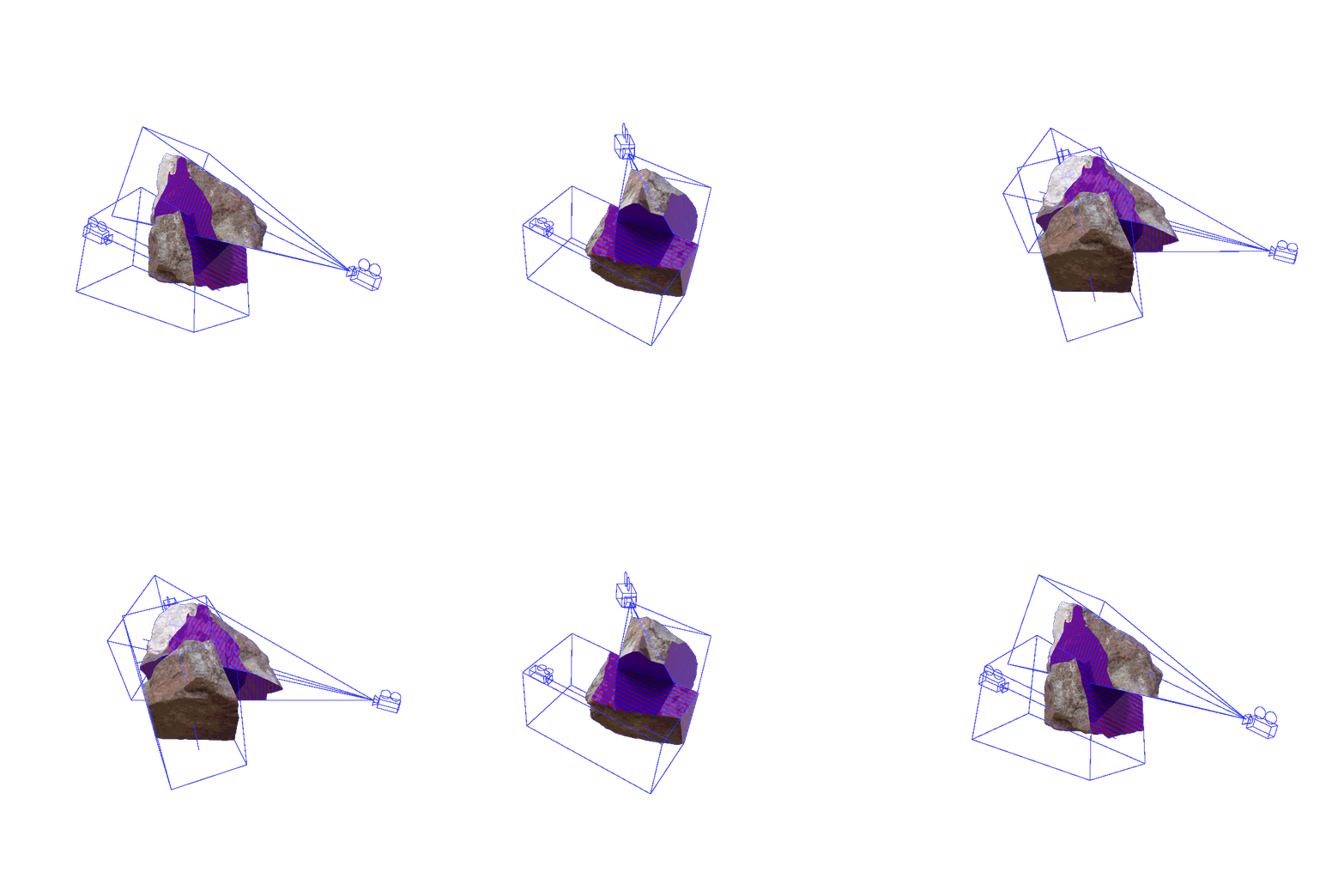
Film director Yasujiro Ozu uses a long diagonal camera to emphasize depth. To Ozu, every relevant subject must be viewed. The only true thing is whatever is filmed. Nothing happened beyond the image. He blurs the line between what is subjective and what is objective. Inspired by Yasuijro Ozu’s filming style, one digital camera with visualized frustum can extract a segment of the space, creating a foreground near the clipping plane and a background far clipping plane. Each frustum segment is “layerable” with another to create an upcycled spatial depth with a digital green screen technique. In this process, existing architectural information is doubled, deleted, bent, and even inverted by layering up camera frustums created with automavision. Students are working as curators to read and reconfigure segments of existing architectural information and then create an upcycled space from an existing housing project.
Stahl House / Pierre Koenig
Stahl House has been designed to overlook Los Angeles from the Hollywood Hills. A famous image of the house was photographed by Julius Shulman that captured the house from the outside looking in. By adding a camera at the center of each panel aiming at the direct opposite panel, we upset the original design by shifting the focus from looking outside to looking inside. “What does it mean to look through glass” is questioned in the process. The separation between the agency of objects and the apparatus of looking can create a new understanding of the life of each object. Combining views in such a camera logic, We see the house has been reseen in perspective views as an endless linear journey with no hierarchy. The digital axon view reveals how the house becomes its exterior with cameras as drivers of remodeling. The uncanny curation slices the open plan and enhances the framing of the structural system.ming of the structural system.
House VI / Peter Eisenman
Animator Peggy Weil worked on a project responding to the sequential diagrams for HOUSE 11A employed by Peter Eisenman to illustrate the role of process in his architecture. The early animation shows how film as a typology for architectural representation could create a continuous loop. Through this animation, Eisenman was aware that the pieces of the house could be moved and repurposed. By responding to the impossibility of how the house has been built, we use greenscreen blanking the architecture space and create a journey constantly moving through thresholds: either through a physical door or a visual slit. The process brings out a house impossible to occupy, even more than the existing one. Initially, the design of the house was done by axonometric. The artificiality of the paper project creates discomfort. The disconnect between use in architecture and giving architecture autonomy has been enhanced.
Kidosaki House / Tadao Ando
There is a paradox with the artificial layered of daylights and realistic material in the animation. We question the difference between the shadow in physical space and the shadow in digital space. Focusing on the fundamental elements of the Kidosaki House, which are light and shadow, we pull the architecture on its term and play with it in its way. After being amplified through digital means, the house created its mini-worlds within itself, with the sun traveling in different skies.
Villa Savoye / Le Corbusier
Elements in Villa Savoye have been presented with finite layers. Ramps, stairs, turning radius, and many more appear and disappear at different speeds in different objects. It is changing how we understand surfaces, orientation, and what are the front and the back, similar to what Le Corbusier was trying to answer. The use of color in this animation helps us identify the familiar moment of the original design. The outside becomes an element of the inside, and the interior still has an unlimited way of looking out.


